The great thing about Android is how many choices it provides. You can swap out the home screen, dialer, keyboard, and even app stores. F-Droid is one of our favorite alternatives to the Play Store, but it's never been very pretty to look at. That's finally changing.
F-Droid has been around for over a decade already. However, as well as it works, it's received remarkably few major updates over the years. That's partly why it still looks like an app that was made 10 years ago. Today, the developer team announced F-Droid 2.0: a brand new rebuild from the ground up.
First things first, the new F-Droid was redesigned from scratch with Kotlin Compose, which is the current standard for Android apps. The app should be much more responsive and fluid than it was before.
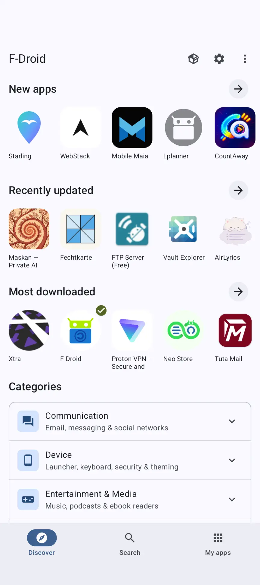
Visually, F-Droid has received a massive redesign. The interface is cleaner, more modern, and supports Material theming. The team also simplified things by cutting down the navigation bar icons from five to three. There's now just "Discover," "Search," and "My apps."
The new F-Droid has more categories, which should make it easier to discover apps. Currently, there are only a few very broad categories that catch a lot of apps. Search has also been improved, which is very welcomed. I've never found it very easy to find apps by search in F-Droid. It can now search app descriptions along with app names (and more). Also, you can use filters while searching.
0. This is largely thanks to pressure from the EU’s Digital Markets Act (DMA) and anti-trust movements.
Source link