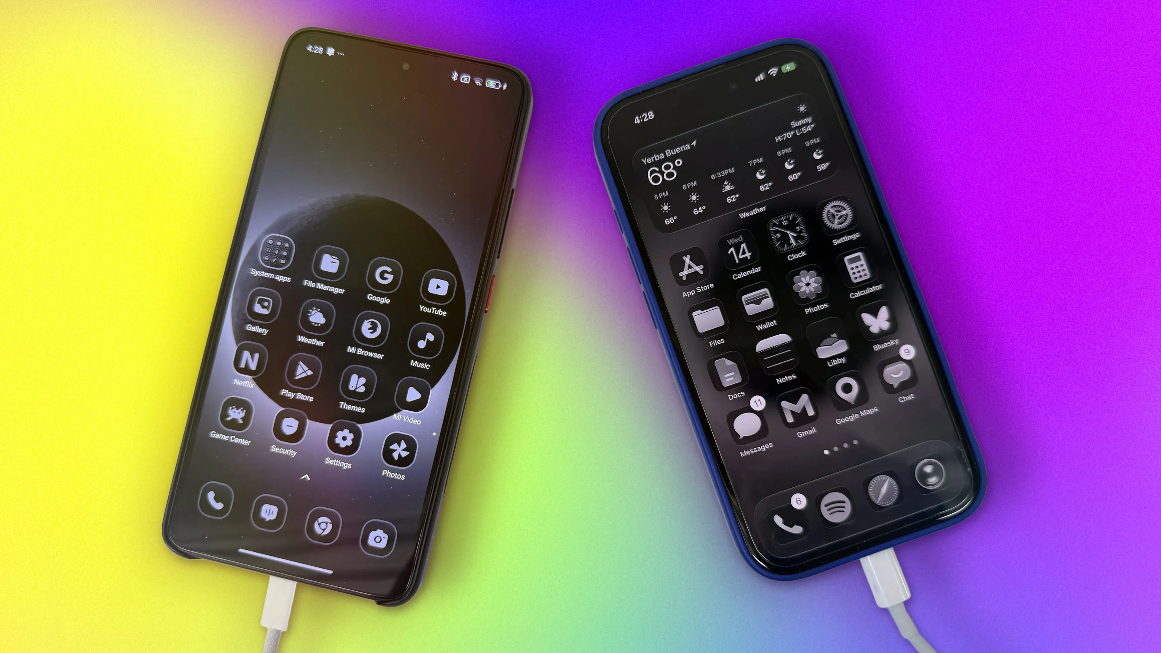
I’m using my phone less after I found the right balance between grayscale and full color.
I know it’s 2026, but hear me out: Our phones should have less color.
Just look at your home screen with all those candy-colored icons. The design might remind you of slot machines in flashy casinos, and that’s not a coincidence. Phones are easy to pick up and hard to put down. If you ever unlocked your phone with a specific intention but ended up spending an hour on TikTok, you know exactly what I’m talking about.
I wanted to break my habit of doomscrolling, so I tried a friend’s suggestion and changed the color filter mode on my iPhone 17 to grayscale. While it did make my phone less distracting, it ultimately became too frustrating to use.
While using grayscale, I found myself toggling back to color mode when I wanted to watch a YouTube video or edit my photos before posting them to social media. After a few days, I was back where I started, using my phone in full color.
A solar eclipse, as seen from space by the crew of Artemis II, makes a stunning image because of the technological achievement it represents. It also makes a cool phone background.
I used that photo of the solar eclipse for my lock screen and home screen wallpaper. And then I tweaked my phone’s Liquid Glass settings.
Since iOS 26, iPhone users have been able to give their apps a Clear appearance , which makes app icons appear translucent, ostensibly to give you a better view of your colorful wallpaper.
Source link