
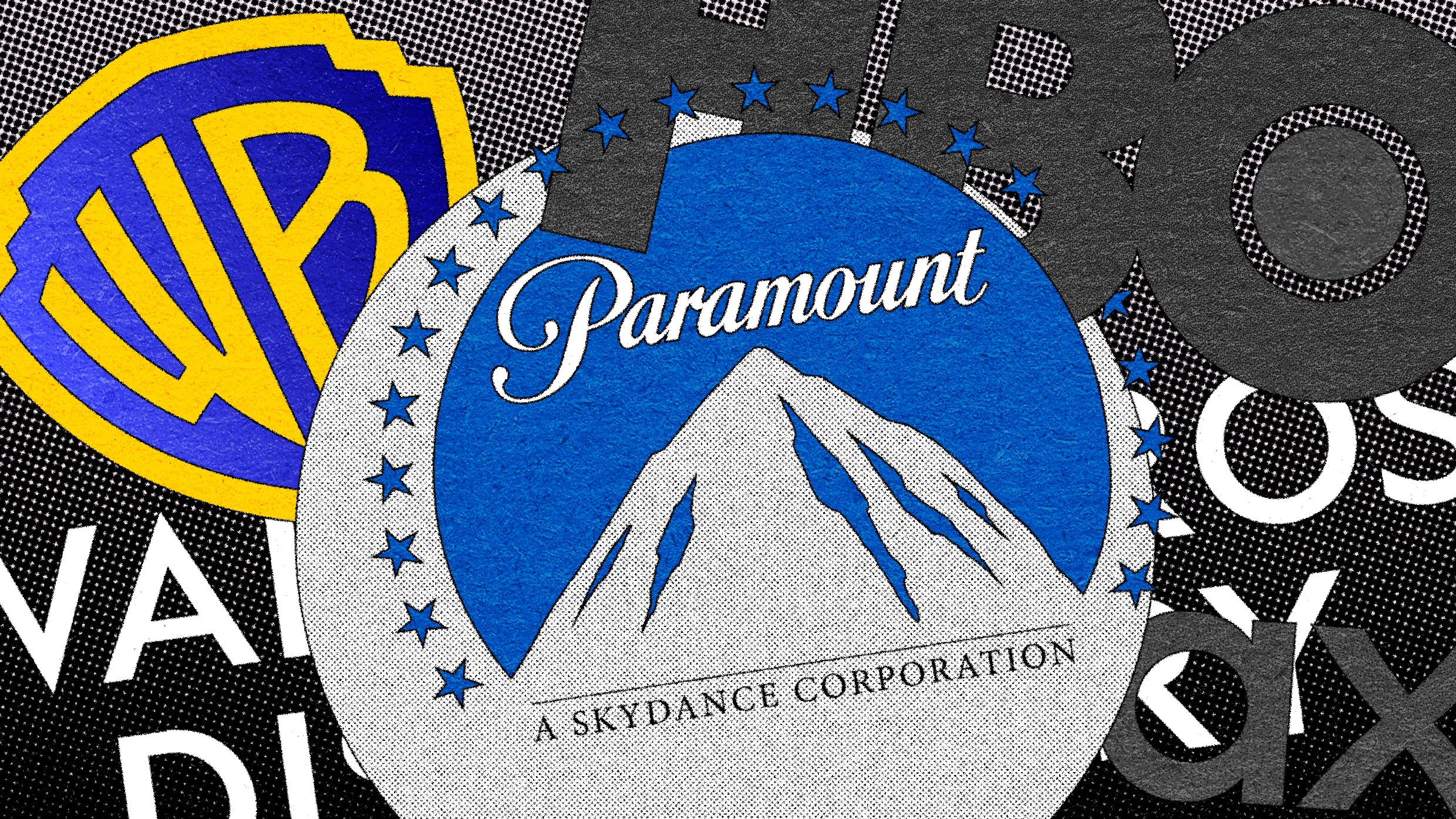
With Paramount Skydance now set to merge with Warner Bros. Discovery, CEO David Ellison is about to control some of the most recognizable logos in American entertainment.
But a very recent history of the companies’ multiple rebrands over the past few years, which typically combined heritage marks with contemporary branding, shows an entertainment industry in flux. In retrospect, their brand evolutions act as visual shorthand: Both the quantity of the changes and the business rationale behind them tell a broader industry story of falling revenue and consolidation.
Ellison, the son of Oracle cofounder and billionaire Larry Ellison, acquired Paramount in 2025 through his production company, Skydance Media. Skydance produced its first film in 2006, Flyboys, which starred the younger Ellison, and it later coproduced films like 2011’s Mission: Impossible–Ghost Protocol and 2022’s Top Gun: Maverick.
By merging with Paramount, Ellison’s production company quickly became an industry player. It acquired a vast trove of assets, including media brands like CBS News and MTV, and beloved intellectual property like SpongeBob SquarePants.
But the resulting logo, released following the acquisition news last year, inartfully smashed elements of the two brands together: Paramount’s longtime logo of a mountain surrounded by stars that’s inspired by Ben Lomond Mountain in Northern Utah, and Skydance’s serif-font wordmark style. It’s since brought back a version of Paramount’s script wordmark and added “A Skydance Corporation” in all-caps serifs below.
The Warner Bros. logo hasn’t had much staying power in recent years either. Pentagram rebranded Warner Bros.
Source link