
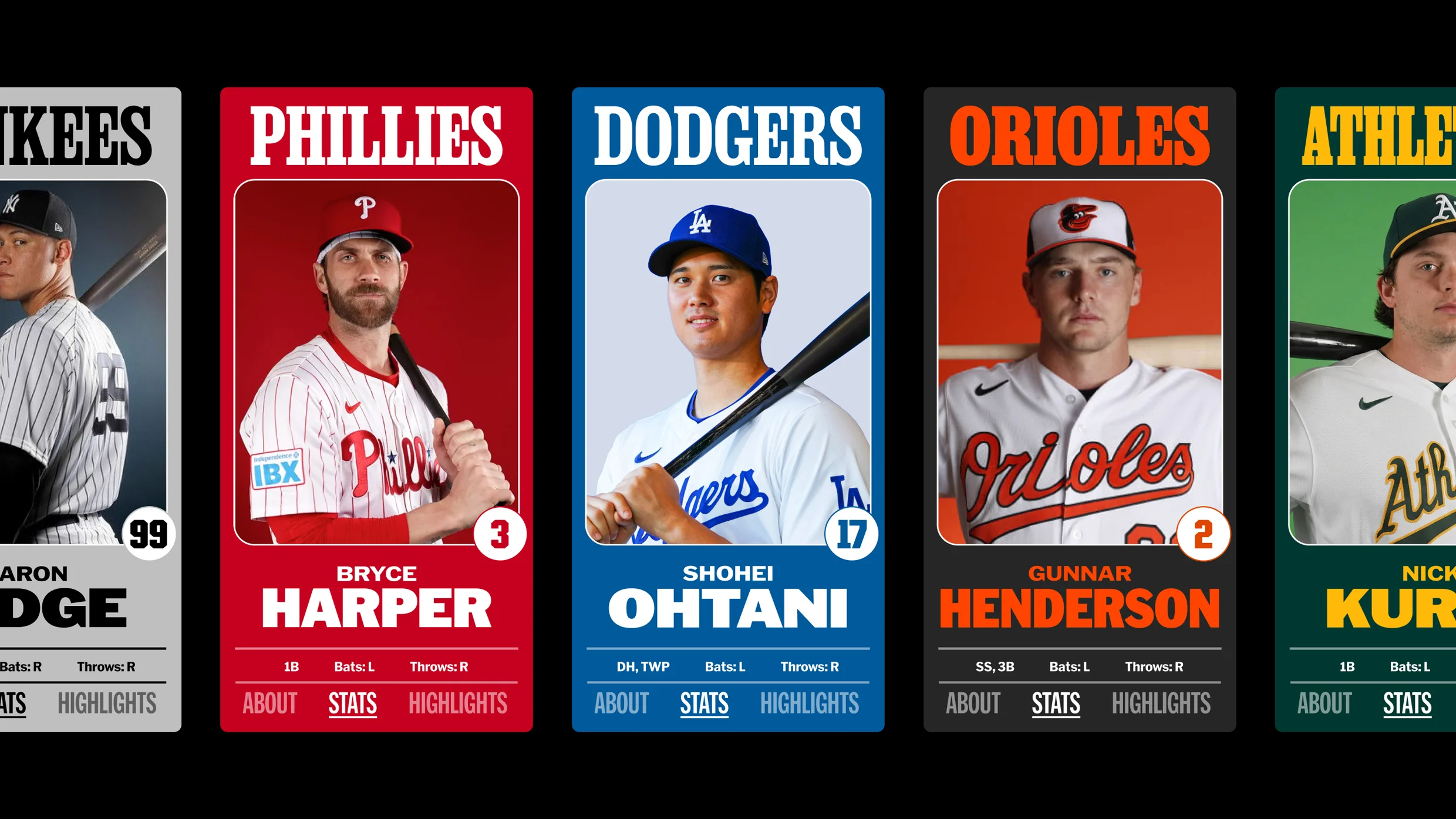
Major League Baseball has a new look, courtesy of an all-star lineup of type designers.
In 2020, after MLB moved to its new headquarters in New York City, it reached out to Mother Design, the branding and design agency behind work for brands like Cadillac, Tripadvisor, and the scented water bottle Air Up. The league was looking to expand professional baseball’s fandom and talent, and it wanted its visual identity to feel unified.
Beginning in late 2022, Mother Design started building out MLB’s new brand architecture, which was introduced beginning in 2024 on a rolling basis. The league’s famous silhouetted batter logo, designed in 1968 by Jerry Dior, was left untouched, but MLB’s wordmark was updated to fit into larger visual system that’s now complete.
As part of the multiyear brand refresh, the agency tapped five type designers or foundries chosen for their individual specialties to build out a one-of-a-kind font book that shows up across the league, from its Ballpark app and venues to social channels and special events.
Each font in the brand—MLB Franklin, MLB Clarendon, MLB Flare, MLB Block, and MLB Script—was chosen because it’s a style that was present in baseball in the early 20th century in some form or another.
“It’s ensuring that we’ve got these visual cues and these letterforms that have been part of our visual vernacular for longer than any of us have been alive,” Mark Sloan, Mother Design’s New York City head of design, tells Fast Company . “How do we make sure that we carry that forward and we honor that tradition, but that we build them in a way that is prepared for retina screens and extremely small spaces as well as emphatic, large moments.
Source link