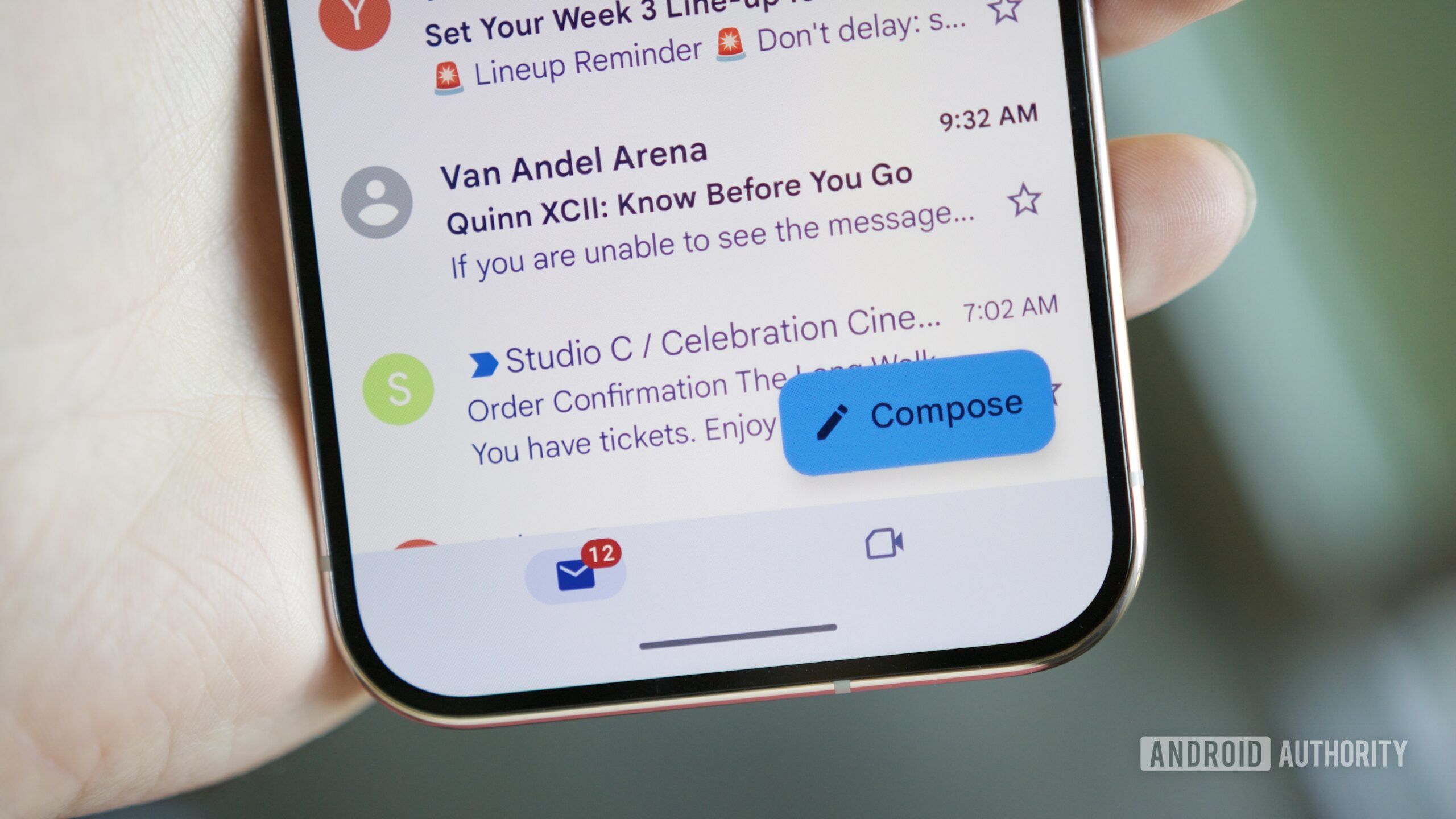
TL;DR Google replaced Gmail’s default yellow stars and yellow importance chevrons with high-contrast, saturated blue markers to improve accessibility.
However, users complain that the identical blue tones flatten the visual hierarchy, make email scanning harder, and add visual clutter.
While there’s no way to revert the changes, you can manually select a yellow star preset (and re-star items) or hide importance chevrons entirely in Settings.
Google is rolling out a visual overhaul to Gmail on the web, replacing its longstanding yellow stars and importance markers with a bright, high-contrast blue. While Gmail has gained plenty of genuinely practical upgrades recently, such as letting you copy 2FA codes directly without opening emails or leveraging AI overview search capabilities , this particular color switch has annoyed desktop users who rely on quick visual cues to scan their messages.
In a post on X , the official Gmail team confirmed the change, explaining that it updated the default star and “Important” label colors from yellow to blue to meet modern accessibility standards and ensure inboxes are easier to read and more inclusive.
Source link