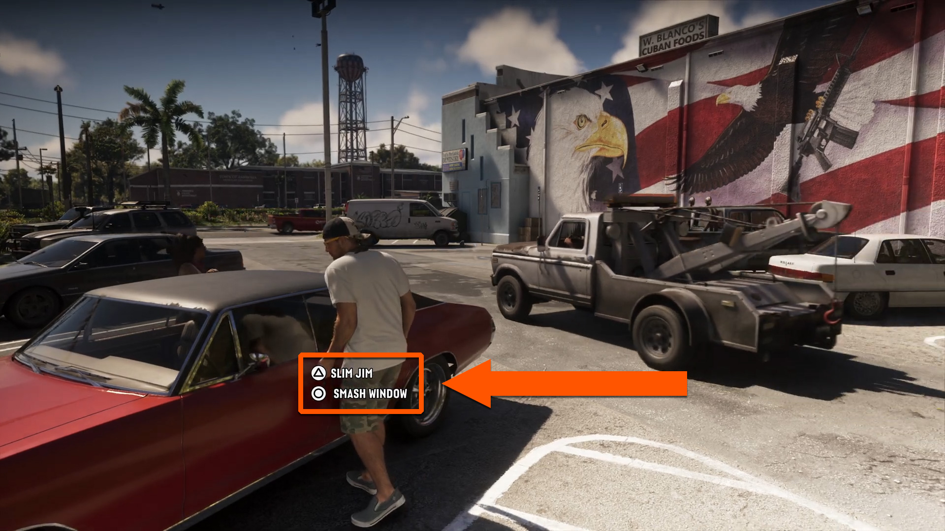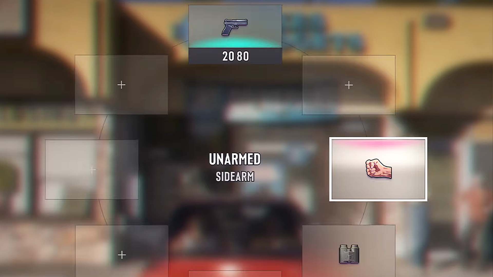
Yesterday, the world got its first (official) look at Grand Theft Auto 6 gameplay via a nearly 30-minute-long trailer. And while reactions to the GTA 6 Extended Look video were mostly positive online, the game’s user interface has become the focus of online debate. Some people say it looks bad. Some like how simple it looks. And a few others are hopeful it might change before launch.
In the hours after the big GTA 6 gameplay reveal went live on Netflix, and then later on YouTube, GTA fans have been picking apart every frame for information. And one detail pulled out of the gameplay trailer has become a fierce online debate: GTA 6’s UI. Specifically, some people aren’t fans of the weapon and item wheel interfaces, which feature colorful icons representing guns, melee weapons, healing items, and pieces of clothing. You can find posts on Twitter, Reddit, and elsewhere of people sharing screenshots of GTA 6‘s UI alongside negative reactions or disappointed comments.
“I don’t like the HUD so far. The minimap looks good, but I’m not especially keen on the weapon wheel,” posted GTA content creator Ben Videotech on Twitter. “I think they need to go back to the drawing board on this.”
“Hot Take: GTA 6 needs to fix this simplistic UI,” posted The GTA Assassin. “It lacks character, and looks undercooked. Rest of the game looks peak.”
“Yeah, the UI is by far my weakest point,” said Gameroll on Twitter . “I’m not gonna criticise the GPS too much because I imagine it will be somewhat customisable, but the rest of the HUD is sort of just serviceable at best.
Source link