

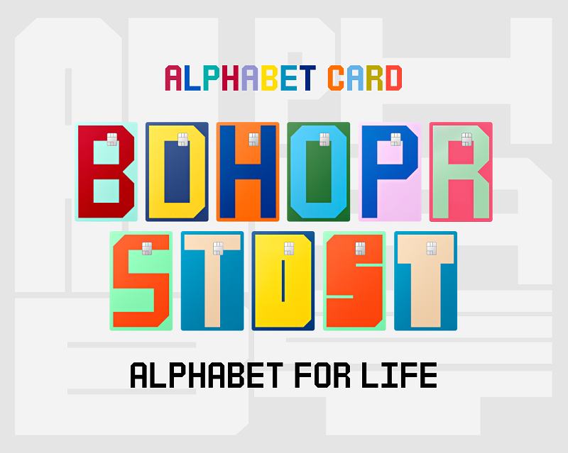
Alphabet Card is built around a category-specific benefits structure in which each letter of the alphabet maps to a spending vertical. Card B covers beauty; Card T covers travel; and so on across a range that includes digital subscriptions and dining. The headline benefit across the range is a 10% discount within the designated category, a deliberately simple proposition designed to reduce the friction of product selection that has long characterised the credit card market.
The defining design decision was the removal of the Hyundai Card corporate logo from the front of the physical cards. Hyundai Card also commissioned a custom typeface and bespoke packaging for the range, creating what it describes as an independent brand identity. That choice is significant: it signals an intention to compete on lifestyle resonance rather than the parent group’s name recognition, and it marks Alphabet Card as a product intended to sit alongside, rather than replace, the existing Hyundai Card M and Hyundai Card ZERO general-purpose lines.
A Hyundai Card spokesperson said the product reflects the company’s view that a credit card can function as an expression of personal taste rather than purely a financial utility. “Alphabet Card represents our effort to rethink not only credit card benefits but also the entire brand experience in response to increasingly diverse consumer lifestyles,” the spokesperson said. “Together, these general-purpose and specialised cards complement each other, further expanding Hyundai Card’s product portfolio.”
The South Korean credit card market is mature and competitive, with issuers including Shinhan Card , Samsung Card and KB Kookmin Card all competing for wallet share among digitally fluent consumers.
Source link