Apple rarely admits a mistake. But when it unveiled new versions of its operating systems this summer, it came close.
“With all major design updates, there’s a natural process where we take a bold leap forward, and then we continue to iterate,” said Apple's human interface designer, Shubham Kedia, during a predictably sleek keynote video. “Our team really appreciates your feedback, and we considered it deeply as we refined the new design.”
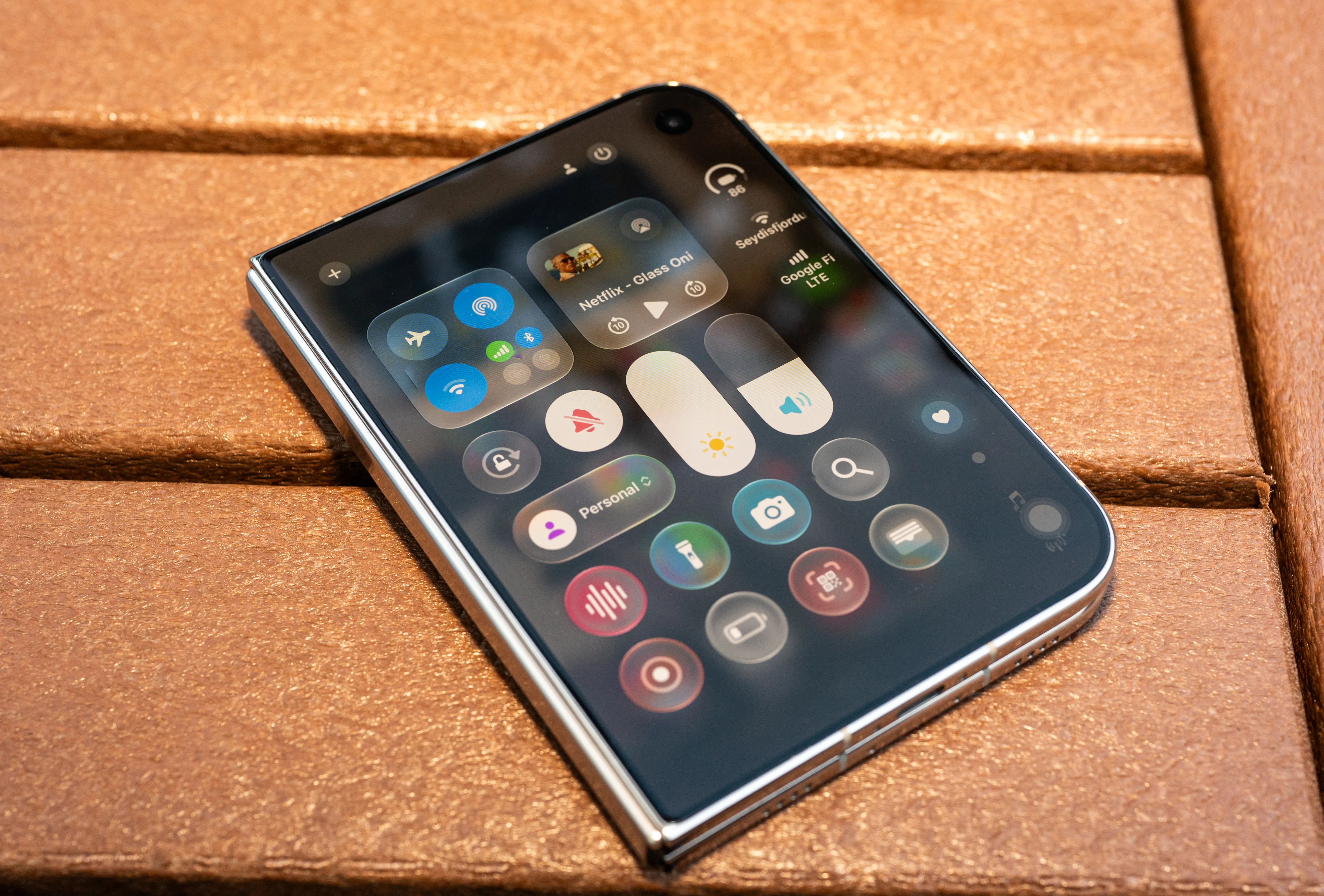
Not quite “Sorry, everyone, we messed up,” but for Apple, practically an apology tour. The subject was Liquid Glass, Apple’s most divisive interface design since at least iOS 7. Apple's Vision Pro mixed-reality headset (which itself flopped) inspired the translucent design language, and the company brought it to millions of other Apple devices.
The result was a mess—at odds with Steve Jobs’ famous line, “Design is not just what it looks like and feels like. Design is how it works.” Liquid Glass started obsessed with gloss and effects, despite promises it would bring your content to the foreground. Yet Apple’s own press release showed interfaces with illegible text. Worse, users found constant reflections and flickering color shifts distracting, and a lack of clarity across devices hurt accessibility.
But iOS 27 , alongside updates to Apple's other software platforms, signaled a shift in priorities after Kedia’s mea culpa. Kedia spoke of reincorporating design cornerstones in what was, if not quite a U-turn, then at least a rediscovery of a core principle: how it works . Instantly, interface elements across Apple devices gained greater clarity and structure, making it easier to tell apps' components from content.
Source link