
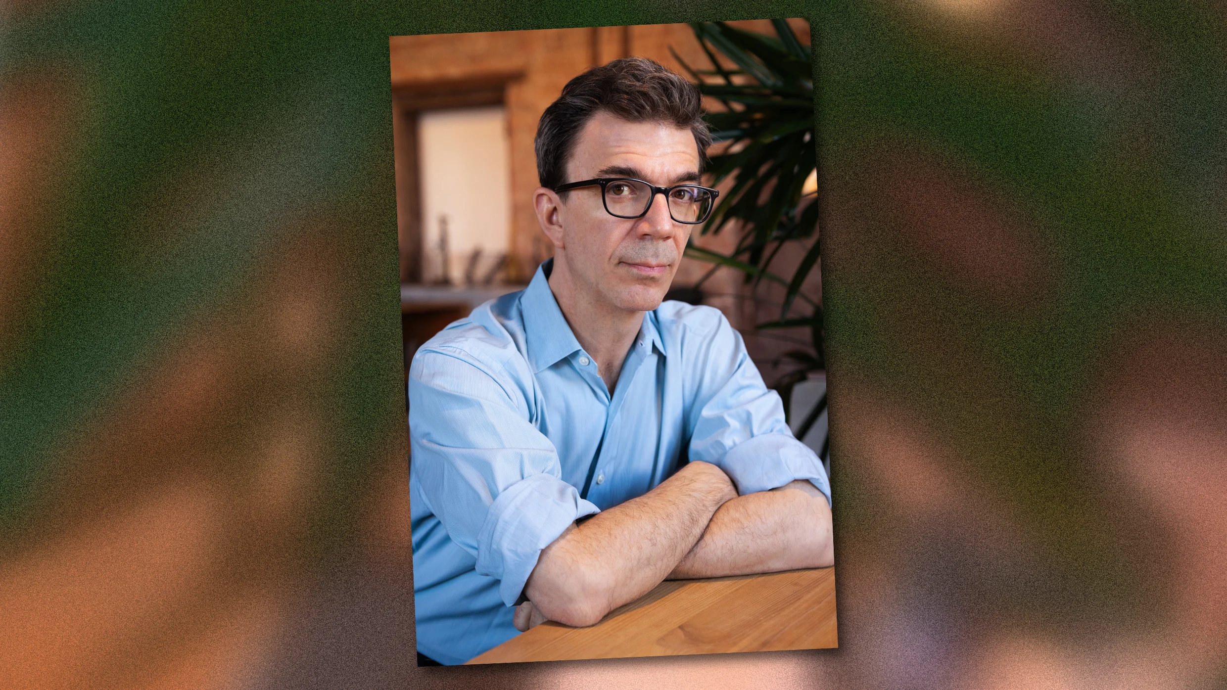
Tobias Frere-Jones has designed typefaces for clients like Martha Stewart Living, the New York City Metropolitan Transportation Authority, Carnegie Hall, Stacey Abrams, Barack Obama’s 2008 campaign, Zohran Mamdani’s mayoral office, the American Civil Liberties Union, New York City Football Club, and many more. Years ago, a friend of his asked him what he thought what letters are made of. Frere-Jones’s answer came quickly and in a single word: negotiation.
As a culture, we agree that letters take a certain shape and carry specific meaning, says Frere-Jones. Running his own typeface foundry in Brooklyn, he describes himself a translator, oscillating between a client’s idea of what their brand or project communicates and his own understanding of the shapes that make letters and what any given design of those shapes communicates to the people looking at it.
Says Frere-Jones: “An important part of my process is to be able to either alternate between two modes—engineer or artist—or hold them in my head simultaneously so they can collaborate with one another.”
The shortest version of my story is that I am a writer who wanted to be a painter. That’s how I came to this. The slightly longer version is that through high school, I was pursuing every kind of visual art I could get my hands onto: drawing and painting and photography. I also enjoyed writing. My brother, father, and great-grandfather were all writers. I came to settle on abstract painting. That’s where I thought I’d want to go. I thought I’d have to choose one and abandon the others.
Source link