

Want more housing market stories from Lance Lambert’s ResiClub in your inbox? Subscribe to the ResiClub newsletter.
When we make county-level home price maps at ResiClub, we usually shade each county by its result. That works, but it has a blind spot: It treats every county the same, no matter how many homes are in it. Out West, in particular, huge counties with very little housing end up dominating the map visually, while small, densely populated counties back East are hard to see.
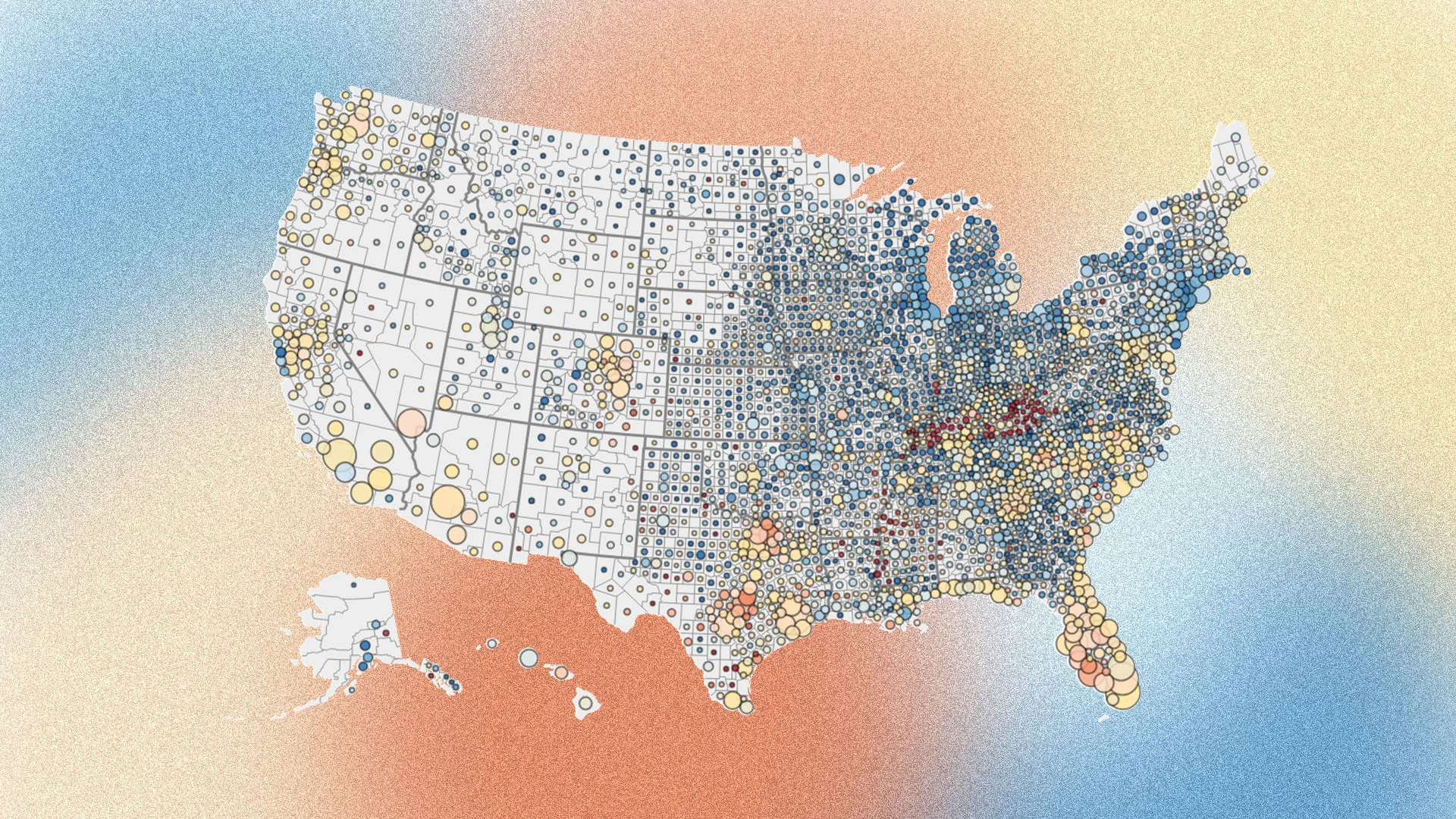
So for today’s piece, we tried something different. We took three of our favorite home price cuts and drew each county as a circle sized by its active housing inventory for sale in September 2026. Circle size serves as a rough proxy for market size, and it also shows where homes are sitting on the market for sale right now.
This cut below compares each county’s aggregate home prices now to its own peak in 2022. Red means the county is still below that peak, and blue means it has climbed past it.
Zooming out to the start of the pandemic housing boom, nearly every county remains well above its March 2020 level. Darker circles mark counties with the largest cumulative/remaining gains.
During the pandemic housing boom, from mid-2020 to mid-2022, there was greater overheating in many growth markets in the Sunbelt, in places like Austin, Texas, and Tampa and Cape Coral, Florida. That greater run-up in home pricing, which further stretched local incomes relative to home prices, is the primary reason those markets were more vulnerable to falling nominal home prices once the boom ended.
Source link