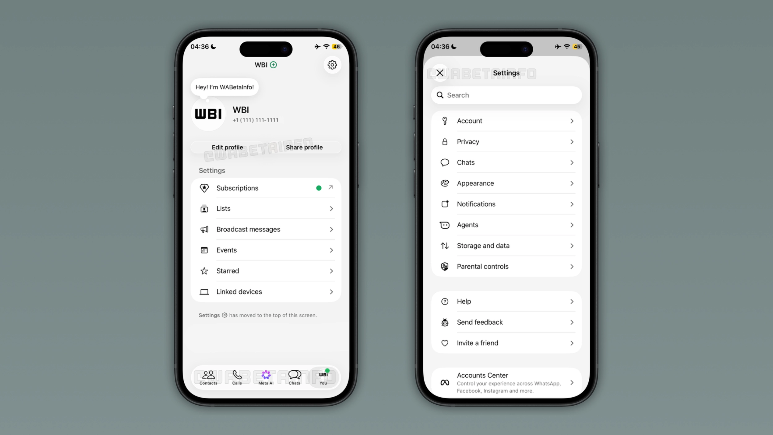
WhatsApp is working on a more simplified interface for the Settings page, making it easier for users to find what they need. The update will move secondary options in a separate menu. This makes the Settings page clearer for users who only need quick access to the most important options.
Enter your email address to subscribe to this blog and receive notifications of new posts by email.
In the post about the WhatsApp beta for iOS 26.27.10.15 update, we announced a redesigned interface for the group info screen. The new interface introduces three tabs to organize content that previously required users to scroll through the screen. WhatsApp also added sections for chat-related settings and a security page. With this update, WhatsApp is actively working to make the interface less cluttered and easier to navigate.
WhatsApp added many new options to the Settings page. For example, WhatsApp introduced a new hub to create and manage events, chats with third-party agents and parental controls. These features further makes the page harder to scan. WhatsApp is now addressing this issue by splitting the tab into two parts. We discovered this with the WhatsApp beta for iOS 26.40.10.21 update, which is available on TestFlight. Specifically, WhatsApp is testing a new Settings layout that keeps the most used options in the You tab and moves everything else to a separate menu.
WhatsApp is testing a redesigned settings page that still shows the account name, profile photo, and phone number at the top of the screen.
Source link